Tel: +44 (0) 203 371 1779
Email: Get in Touch
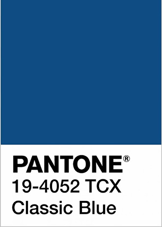
When Pantone announced its Colour of the Year 2020 as ‘Classic Blue’, we did a little happy dance here in the RWD studio! A perennial favourite of ours, blue has become increasingly popular with our clients in recent months and it’s easy to see why. Timeless and highly versatile, blue hues comfort and sustain us with their reassuring evocations of the sky and the sea.

Here, we look at why blue is such an effective colour to use in interiors, and explore some of the ways in which our design team has applied this versatile shade to some of our projects.
One of the great things about blue is its versatility. Dark tones can bring drama to a space whereas paler shades can act as a calming base note. Blue also pairs well with many other colours and there are so many variations there really is something for everyone.
Blues are also intrinsically uplifting. From a psychological point of view, we associate blue with the clear, sunny skies of summer. So being surrounded by blue cannot help but lift our spirits. Add to that the timeless, classic quality of the colour blue and you’re really onto a winner.

When ‘Classic Blue’ was declared Colour of the Year 2020, the Pantone people described it as ‘a solid and dependable blue hue we can always rely on’. And we all need calm and reassuring colours in our lives!
Paler shades of blue bring with them an inherent sense of sophistication, helping to create a calm and refined air. In the case of our Carlton Hill reception room, our client had stated a preference for duck egg blue but had assumed we might use it solely as an accent colour. The idea of using Little Greene’s ‘Bone China Blue’ – an ethereal blue-grey shade – throughout the room took a little persuasion, but the results are exceptional.
We used this fresh blue tone on all the walls of this grand space, including the cornicing, to emphasise the ceiling height and create a real feature of the architectural details. We varied the metallic finishes throughout the room by using materials such as antique brass, bronze and blackened steel to enhance the sense of timelessness. And fabrics were kept neutral but textured to let the tranquility of the pale, blue walls dominate the space.
How do you create a predominantly blue scheme while still achieving contrast and interest to please the eye? We believe the answer is texture. In the guest room of our Broad Walk project, the star of the show is a braided hemp grass wallpaper from Maya Romanoff. This deep navy paper sets the overall tone of the room with its heavy texture and dramatic feel.
We then continued the look with the addition of bespoke bedside tables clad in blue-grey gunmetal with horsehair drawer fronts featuring a blue-and-amber stripe. Even the rug beneath the bed hints at the blue palette with its plush pile and teal trim detail. The bronze wall lights and charcoal mirror veer slightly from the all-blue theme, but in doing so they add visual interest and a sense of luxury.
Sometimes colour choices are all about what’s going to go on the walls rather than the walls themselves. And this was definitely the case with our Bromptons project. Our client’s knew from the outset that they wanted their formal drawing room to be home to some of the most prized items from their extensive art collection. Our team spent an entire day assessing which artworks should be used in this room and where they should be placed. These decisions then fed into our colour choice for the walls.
Because many of the grand oil paintings selected had green tones in them, we specified a shade of blue with a green undertone to complement the artwork. Then to create a striking contrast, we painted the ceiling, coving and edges of the panelling in brilliant white. The result? An elegant yet dramatic scheme with a distinct sense of grandeur.
Not only was our client delighted with the finished room, the blue we selected also proved to be a huge hit on Instagram! Hundreds of you got in touch to ask about this specific colour when we posted a photo of the Bromptons drawing room online. Not the catchiest of names, unfortunately, but for the record it’s 30BG37/110 matt emulsion from Dulux.
Blue may seem like a fairly obvious choice for a boy’s bedroom, but an all-blue room doesn’t have to boring. Far from it. The key is to find a strong visual starting point and then continue the theme throughout the room.
In the case of the boy’s bedroom in our Broad Walk project, the initial focal point was a curved chair we sourced from the Milan furniture fair, Salone del Mobile. The faceted nature of this chair inspired us to create a bank of geometric shelving – also in blue – to which we added wallpaper with a rhythmic pattern featuring New York skyscrapers.
Given the strong base of geometric patterns, it made sense to use predominantly blue tones with the occasional hint of grey and a few pops of orange for added visual interest. The result is a cohesive, timeless look which – as specified by the client – will be slow to date.
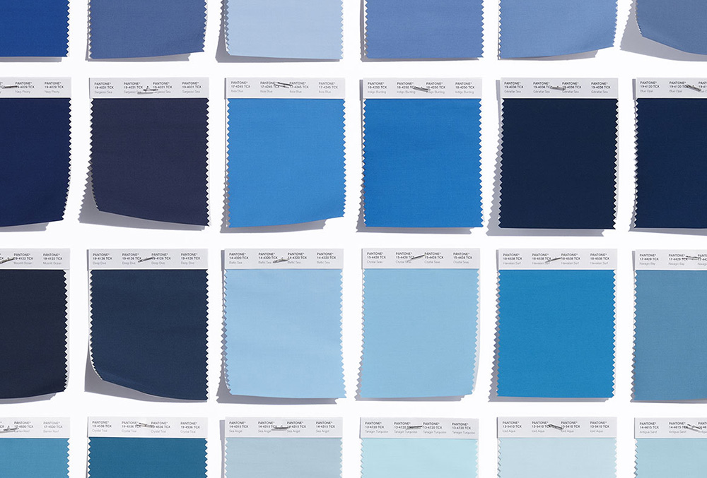
One of the reasons blue is such a versatile colour is the fact that it comes in so many different shades. This means it’s absolutely crucial to choose the right tone of blue for your particular project. Blues with a grey undertone tend to lend a more sophisticated feel while those with green tones add drama.
The great thing about blue is that you can be really creative with it because it’s such an adaptable colour. It provides the perfect contrast to both pastels and primary colours and works really well when used in bold paint patterns such as stripes or chevrons. So don’t be afraid to really go for it with blue and shake things up a bit!
Painting architectural details such as panelling, cornicing and moulded ceilings blue is a really unusual and effective way to highlight period features. Such is its versatility, blue can add an element of drama without fighting with the rest of the scheme.
Firing up the fifth wall From the starry depictions of ancient Egyptians and divine murals of the Greeks to the intricate storytelling of Renaissance frescos, ceiling design has undergone dramatic changes through the ages. Historically, ceilings served as the crowning glory of interior spaces. However, with the passage of time and ever-evolving trends, enthusiasm for...
In our recent blog posts, we have explored planning a renovation, achieving the ultimate luxury look in your home, and the difference between the two design disciplines of interior design and interior architecture. In this post, we discuss when working with an interior designer is the right choice, guide you through the process of finding...
We use cookies to ensure that we give you the best experience on our website. See our Cookie Policy. If you continue to use our website, we will assume that you are happy with it. OK

