Tel: +44 (0) 203 371 1779
Email: Get in Touch
As part of our occasional series of behind-the-scenes blogs, Creative Director Roselind Wilson talks us through the innovative interior redesign of Coppice Walk – a five-bedroom 1930s property in North London.
The main focus of this dramatic redesign was to achieve a flexible, entertaining space that would work equally well for formal or informal gatherings. The space has been completely transformed via clever design and the layering of carefully-chosen colours and textures. Most notably, all this has been achieved without the need for any major changes to the interior architecture.

Our clients love to entertain, but the existing space – which consisted of an open-plan kitchen/living/dining room – wasn’t working for them. They wanted to create an elegant, aspirational feel for the space, while building in functionality that would work for both large and small social gatherings.
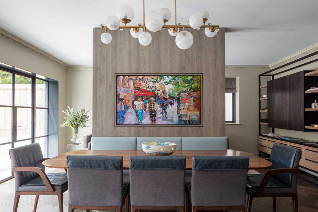
The answer was to introduce a floor-to-ceiling dividing wall that would act as a breakpoint for the different functions of the space. Not only did the wall transform the space, creating much-needed grandeur and character, it also makes a clear demarcation between the living and dining areas.
The dividing wall is clad in an oak effect veneer to add texture, and it also incorporates a pivoting TV which can be turned to face either the living or dining area. It’s a fun bit of technology which not only future proofs the property, it also delights our clients on a daily basis!

Our client loves colour in her wardrobe, but she wasn’t initially confident with the idea of bringing colour into her home. Sometimes, as interior designers, our role is to gently nudge our clients out of their comfort zone in order to help them achieve the best possible results. So, with this client, we gently suggested subtle background shades and then incorporated lots of different textures to create visual interest.
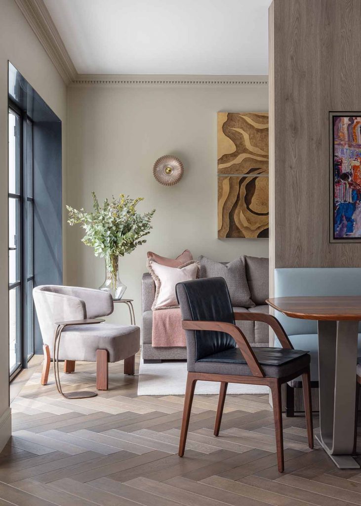
We started with chevron timber flooring to add warmth and continuity, and then added layers of texture with contrasting wood finishes, fabrics and interesting artworks. The dividing wall between the dining and living areas also adds colour and character thanks to the brightly coloured artwork on the reverse of the TV. Our clients can pivot the TV to choose whether the artwork faces the dining or living side of the room. It’s such an interesting talking point and our clients really love this feature.
We also added decorative cornicing to the top of the walls to bring in another layer of texture. My tip here when introducing decorative features is to ensure you select details that match the original period of the house.

The choice of artwork for this project became absolutely vital to the design aesthetic as a whole. The art we chose introduced some much-needed colour and vibrancy against the neutral backdrop, and helped to reflect our clients’ personalities.
As is often the case with our work, we encouraged our clients to commission some bespoke pieces to create an eclectic look and to add more character. The painting on the reverse of the TV is of a busy café scene in Paris. It brings colour and energy to the living/dining space which is in keeping with its sociable function. The textured gold artwork behind the sofa has a 3D effect made from real gold leaf. It’s wonderfully textural which is just what this space needed.

We are incredibly pleased with the level of transformation achieved here without making any structural changes. The space really is unrecognisable and works so well now for this very sociable family. We’ve managed to create a contemporary but very homely interior which feels expansive with a wonderful sense of flow.
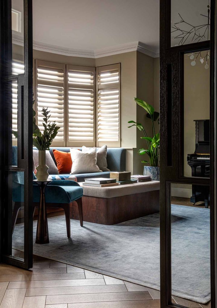
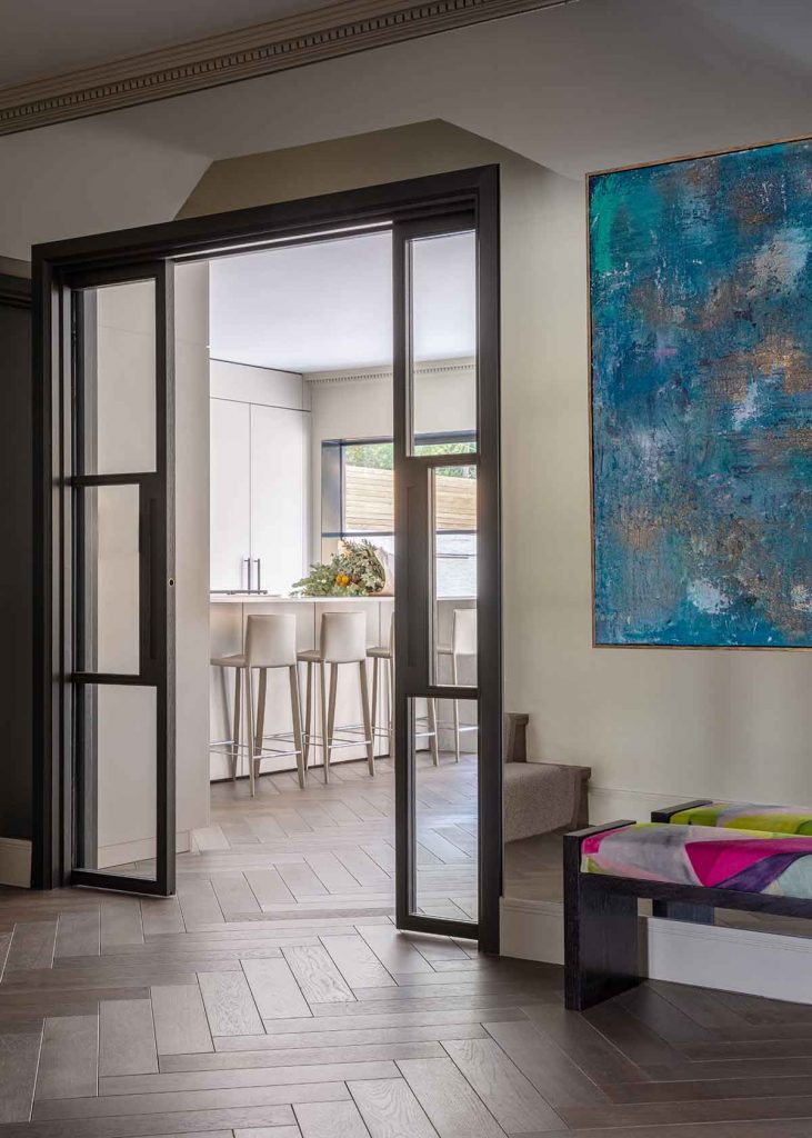
The new glass doors we introduced throughout the ground floor were particularly successful. They allow for a number of vantage points from room to room, making the whole space feel lighter and bigger. The doors were made in a dark timber to hint at the style of the Crittall doors that open onto the garden. And for the Crittall doors themselves, we clad the reveals in a dark metal which brings the whole look together.

Our clients are beyond happy with the way we have transformed their interior. They actually told us the redesign has changed their lives! There’s no doubt the couple have a great sense of style, but they didn’t know how to translate that into their home. The living space now has huge visual impact as well as working brilliantly on a functional level – our clients couldn’t be happier!
1) Add texture to create additional interest
Introducing layers of texture is a great way to add character to your interior. You can use varying timbers, fabrics and rugs, as well as adding architectural details such as decorative cornicing, panelling and architraves. In the case of our Coppice Walk project, we consciously varied the levels of sheen at play within the scheme to create contrast and interest.
2) Use artwork to inject colour and personality
Artwork plays a vital role in finishing the narrative in any interior and serves as a way to bring colour and character into a scheme. We recommend taking a mixed approach by using lots of different types of artwork, varying paintings, prints, 3D wall art and family photos. Commissioning bespoke artwork is the perfect way to express your personality. Working in conjunction with an artist, you can create a unique piece which makes a visual statement while telling a personal story at the same time.
3) Be bold with your colour palette
Introducing colour is a great way to make a space feel more homely and welcoming, but some of our clients feel more comfortable experimenting with whites and off-whites than with bolder hues. Our approach at Roselind Wilson Design is to gently guide our clients towards colours we feel best suit their unique character and lifestyle. So if a client isn’t naturally drawn to bold colours, we can still mirror their energy to create a beautiful, coordinated colour palette for their scheme.
Work with our team of luxury designers
Adding character and personality doesn’t need to be daunting, let our expert team help you complete your home renovation project with confidence.
The Magic of Multifunctionality Whether in London or another bustling city, urban living offers a vibrant and dynamic experience. Yet, amidst the allure, it often comes with a familiar challenge – Limited space. However, small square footage should never mean sacrificing style or functionality. Through the power of inventive interior architecture, even the cosiest homes...
When space is limited, making the most of every inch is essential. Smart design can transform rooms into multifunctional spaces, doubling their purpose and enhancing functionality. However, without careful planning, these spaces risk feeling cluttered and undefined—falling short of their true potential. At Roselind Wilson Design, we see every space as an opportunity to create...
We use cookies to ensure that we give you the best experience on our website. See our Cookie Policy. If you continue to use our website, we will assume that you are happy with it. OK

