Tel: +44 (0) 203 371 1779
Email: Get in Touch
Some of the best things in life come in small packages and our recent luxury interior refurbishment of a compact apartment in the heart of London’s West End is no exception. We tour the interior of our recently completed Fitzrovia redesign.
Our client was very clear about his requirements for the property, which resulted in one of our most exciting briefs to date. Top of his list was a luxury, light-filled pied-à-terre incorporating two bedrooms, two bathrooms and plenty of space for entertaining – all incorporated in 650 square feet of living space. He also specified high-end materials, plenty of built-in storage and a spacious, open-plan feel.
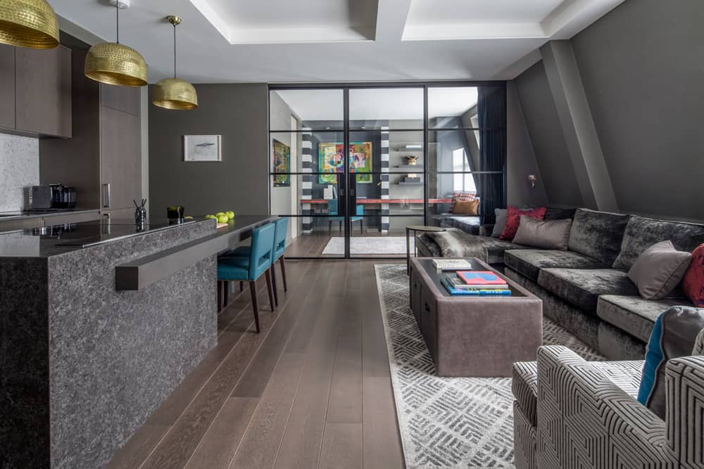
We had an instant connection with the client from the moment we met. After our initial meeting, we would spend time on the phone most evenings discussing his vision for the space. Spending all this time upfront meant that we were able to get a really good feel for our client’s personality and, as a result, we were able to meet all of his requirements.
Charismatic and well-travelled, our client wanted his London pied-à-terre to reflect his vibrant personality with bold colours, textures and some serious wow factor. From a functional point of view, the apartment needed to accommodate visiting friends and family, as well as act as a welcoming bolthole for when he returned from his travels. Hence the need for the second bedroom to also work as a study for times when guests were not visiting.
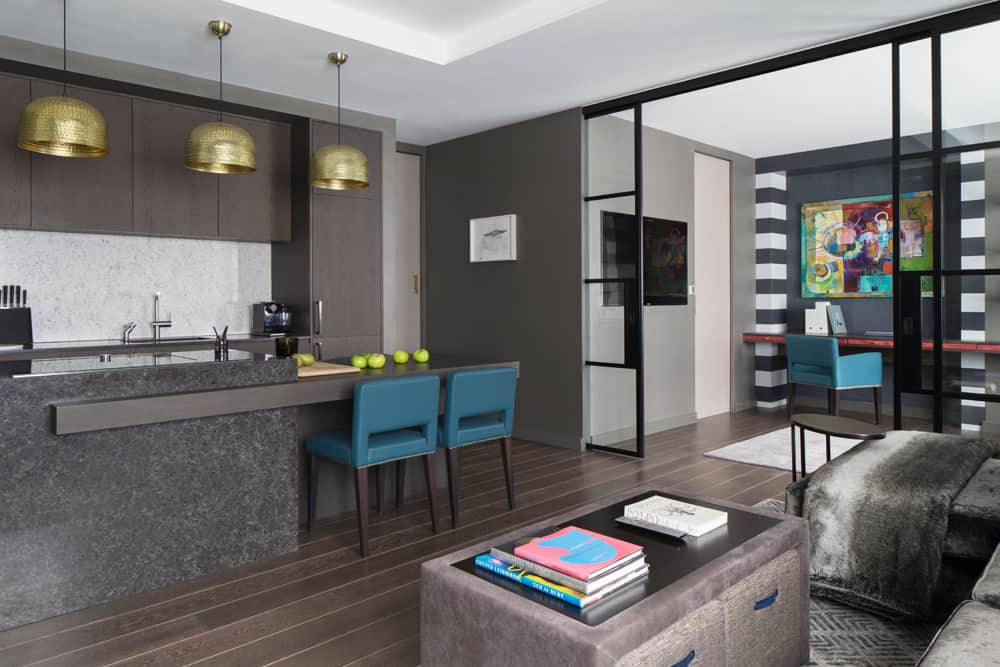
There were a few challenges in relation to the layout of the apartment because our client wanted to incorporate alot into a relatively small space. We designed all the internal doors as pocket doors to create an open-plan feel and allow light to flood throughout the apartment. Another space-saving feature is the aubergine-coloured kitchen island, which has a lower section at one end that can be extended to provide comfortable dining for up to seven people. Seating requirements in the living area have also been carefully thought through. In addition to the large charcoal velvet sofa and geometric armchair, the bespoke ottoman incorporates extra pouffes which can be brought out as required.
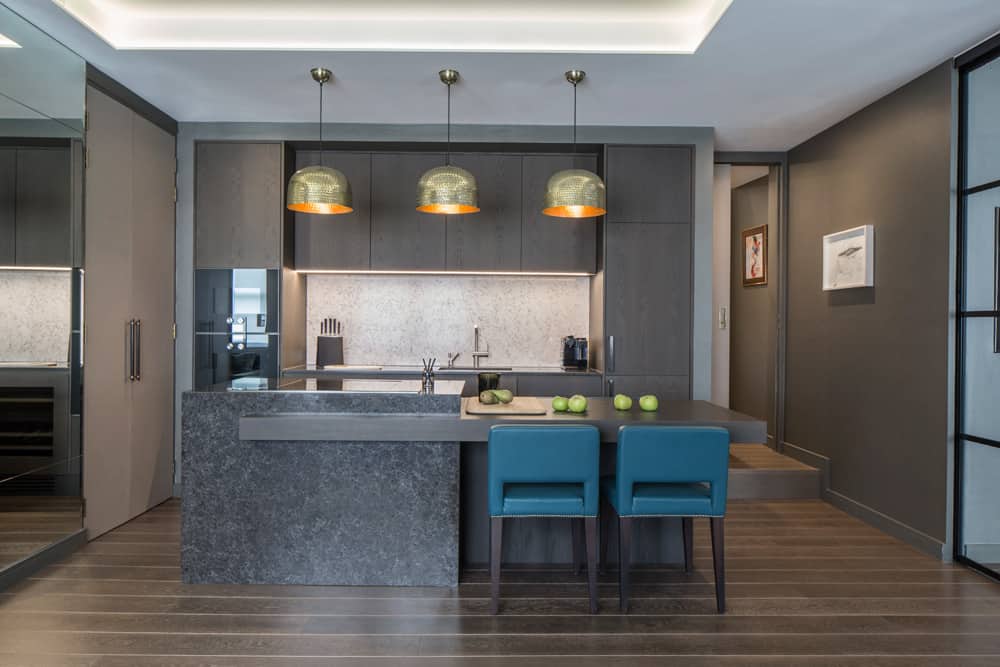
The apartment is all about luxury. We specified brass sanitaryware in the bathrooms from The Watermark Collection and kitchen appliances by Gaggenau and Miele. Due to our client’s love of marble, the bathrooms feature exquisite marble sinks and the kitchen island and splashbacks are a stunning marble effect composite.
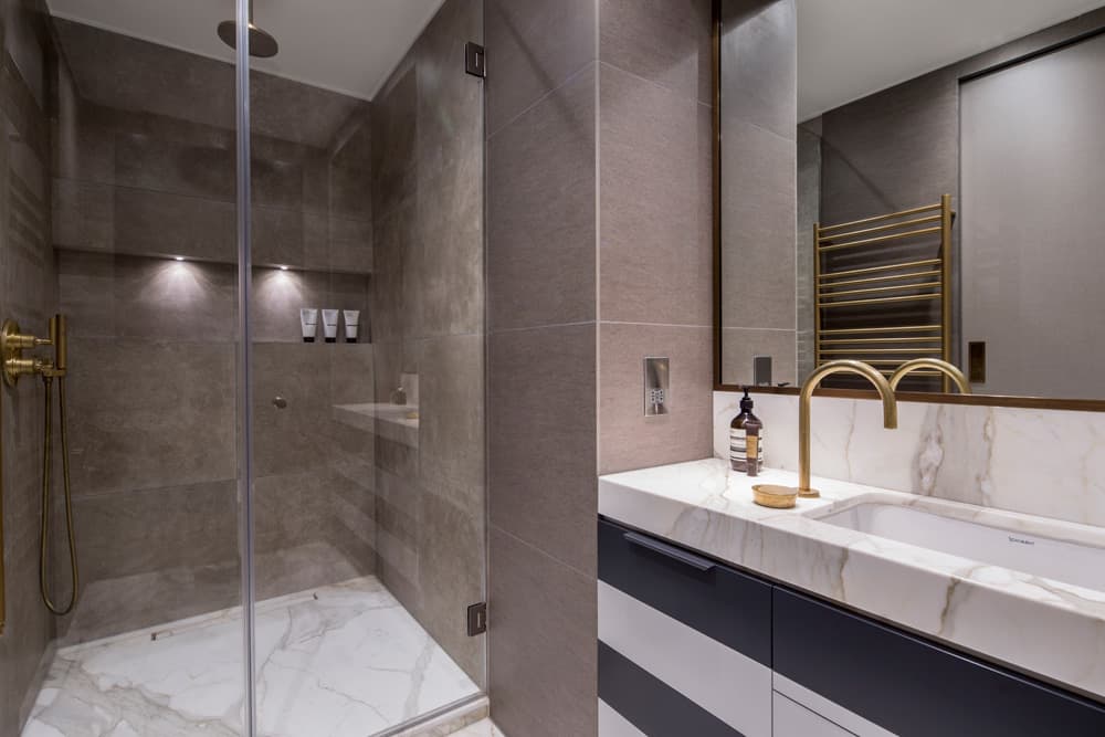
Bespoke elements have also played a key role in the design. As you enter the apartment, you pass through a smoked perspex pocket door with a bronze frame, which was specifically requested by our client to create a dramatic reveal of the apartment’s interior to his guests. Also bespoke are the antique brass bedside lights in the master bedroom, which feature textured shades in red and gold horse hair. The vanity unit in the ensuite bathroom is also bespoke, featuring bold horizontal charcoal stripes that tie in with the rug in the master bedroom and the joinery in the guest bedroom/study area. The apartment also features original naïve artwork by Spanish painter Javier Isidoro Aixa.
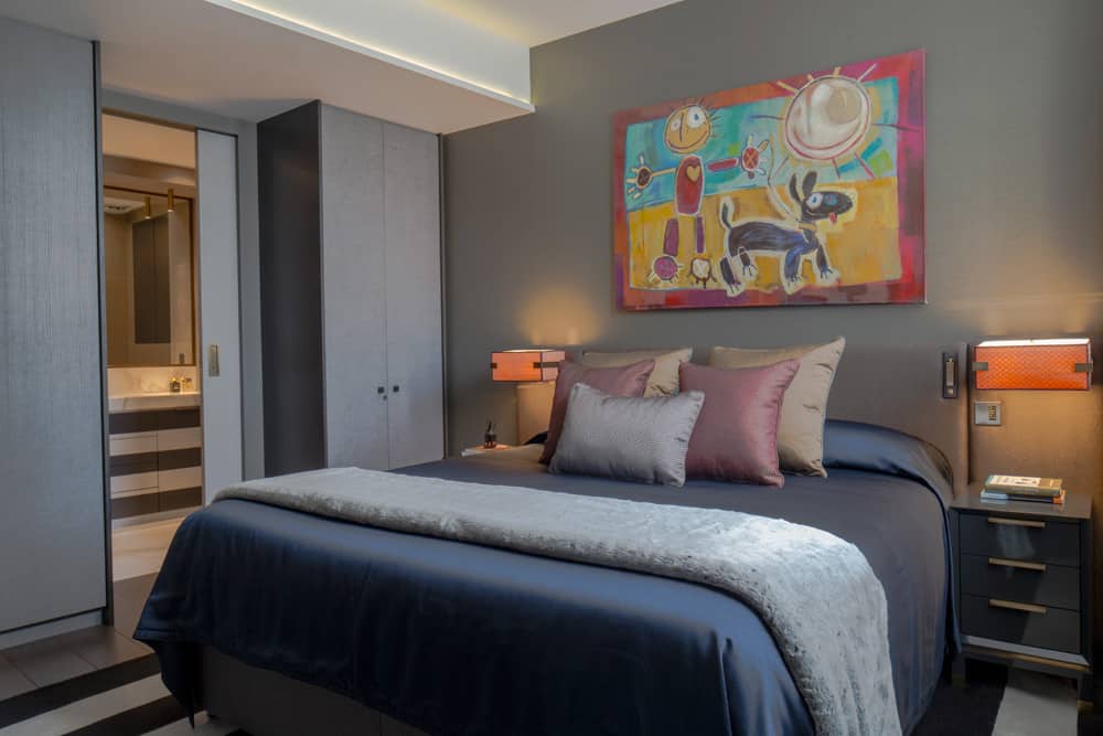
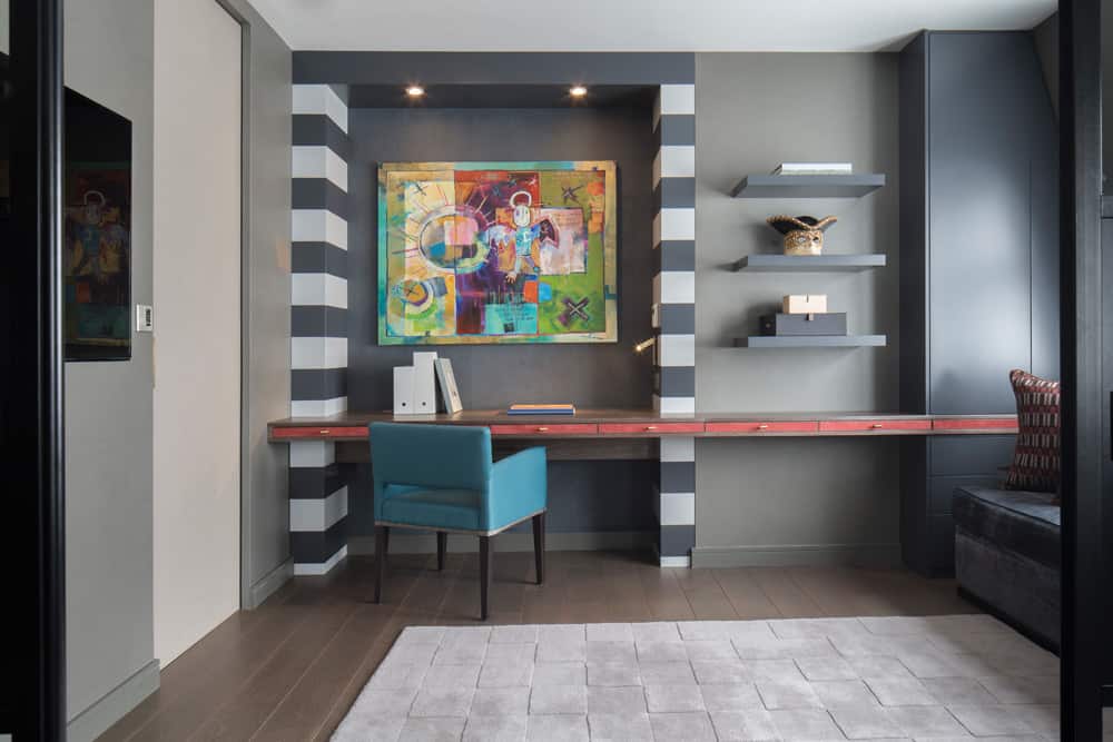
The end result is a wonderfully versatile two-bedroom apartment that packs a serious punch for its relatively modest 650 sq ft. Rich colours and opulent furnishings have been combined to create a luxurious yet highly functional space.
We’re delighted with what we achieved with the design because we successfully implemented every detail our client wanted and totally exceeded his expectations. When he first walked into the finished apartment, our client was so overwhelmed he became quite tearful! And every time we’ve spoken since he tells us how much he absolutely loves the apartment. It really couldn’t have worked out better!
View our Portfolio page to see more of our luxury interior design projects.
Photography by Richard Waite
As disciplines Interior Architecture and Interior Design will always be intertwined. In the quest to create spaces that function equally successfully on both a practical and aesthetic level. A beautifully designed home isn’t just about visual aesthetics, it’s about how a space works, flows, and adapts to the needs of those who live in it....
The Magic of Multifunctionality Whether in London or another bustling city, urban living offers a vibrant and dynamic experience. Yet, amidst the allure, it often comes with a familiar challenge – Limited space. However, small square footage should never mean sacrificing style or functionality. Through the power of inventive interior architecture, even the cosiest homes...
We use cookies to ensure that we give you the best experience on our website. See our Cookie Policy. If you continue to use our website, we will assume that you are happy with it. OK

