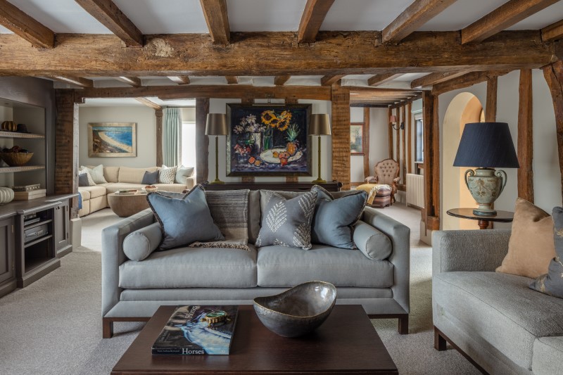
As we head towards the height of the festive season, Creative Director Roselind Wilson talks us through the redesign of a characterful Seventeenth-Century farmhouse. The perfect place in which to hunker down for Christmas, this much-loved family home in rural Suffolk showcases an elegant blend of contemporary elements alongside existing period features.


What was the starting point for this design?
It was all about the period architecture of the house. Our clients, who have lived at the property for more than 40 years, wanted us to breathe new life into their home while respecting its character. The centuries-old beams formed the basis of almost every aspect of the redesign of this house.
Our brief was to create a cleaner and more contemporary look, while still retaining a relaxed and homely feel for the farmhouse. So this meant bringing in contemporary touches that would complement and enhance the original features.
It helped that we’d worked with these clients before on the redesign of their London home so we were familiar with their tastes and how they like to operate. This meant they trusted our judgement and we were able to nudge them towards braver, more quirky design decisions with some aspects of the house.


How did you go about combining old with new?
The key is to create interesting contrasts which are sympathetic to their historic surroundings. For example, in the kitchen, we introduced contemporary colour in the form of teal blue cabinetry and added extra texture and contrast with the half-height panelling painted in a soft, modern grey. The shaker style cabinetry gives a contemporary feel but is still very much following classic lines.
On the landing, we paired old and new by adding a bright fabric to the antique, barley twist chairs. The fabric has a modern, timeless feel and our clients absolutely love it. It works so well with the bright artworks on the gallery wall and the pop of extra colour in the form of the blue radiator.
There are a number of bespoke elements in our design which were also central to our blend of contemporary and classic pieces. In the TV room, we went for a comfortable and relaxed L-shaped sofa in a bobbly, bouclé fabric. Alongside that, we designed an oval, limed oak coffee. which together with the sofa, forms the more modern aspect of the room and provides an interesting contrast with the fireplace and beams.
How important were the textural elements in this project?
Because the colour palette we chose is predominantly neutral, the textural elements in this house became really important. We kept the colours pale to complement the dark beams and then used texture to provide additional contrast and interest.
There’s an abundance of rattan in the interiors world right now, and we were lucky enough to have plenty of it in the house in the form of our clients’ gorgeous rattan bateau lit beds. We then added in more texture where we felt it was appropriate, such as the salmon pink bedspread and gloss crackled yellow lamps in one of the guest rooms.
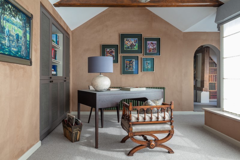
In the sunroom, which the client uses as his study, we played with lots of different textures by using a caramel suede wallpaper, a desk clad in pale blue leather, and shelves with brass stud detailing. The bright green radiator picks up the colour in the artwork.
We also designed a bespoke Japanese-style bench which is one of our favourite elements in the house. The bamboo style fits in perfectly, and the rattan back gives a nod to the other rattan pieces in the house. Paired with two Japanese silk footstools, the bench creates a perfect little pocket of space.
What about the artwork in this house?
Artwork played a big part in connecting the different spaces within the farmhouse. Our clients already had an extensive and varied art collection
so we didn’t need to commission any new art. Our job was to reframe everything to make it look more characterful, and then decide where to hang the paintings. This was quite a challenge because everything is so wonky in this house because of its age. Most of the beams run at very unusual angles! But it all worked out so well – particularly with the gallery wall on the landing.
The main thing to remember when you’re putting modern artwork against older features is to balance it out by putting the odd classic piece into the mix. If you just scatter a classic architectural backdrop with abstract art it can look a bit contrived.
How did the clients feel about the end result?
They were absolutely delighted. They keep sending us emails saying how much they adore the house! We’ve breathed new life into the home they’ve loved for years. They can live comfortably there now and just enjoy it because everything is exactly as they want it to be.
Our 3 top tips for combining old and new
1) Lean into the contrast
Don’t be afraid to go for it with contrast by taking a contemporary piece and putting it against something old. In the case of our Suffolk farmhouse, we placed modern, floor-standing speakers on either side of the brick fireplace in the reception room. This juxtaposition between new and old works so well.
2) Choose your shapes carefully
When it comes to modern furniture in a period setting, don’t choose a scroll arm for your sofa, instead, go for a square-shaped arm. This will make the shapes in your space read differently against one another. In the TV room for this project, for example, we designed a squared-off sofa and a chunky, oval coffee table to create maximum contrast with the beams and the brickwork.
3) Use art to bridge the gap
Artwork can be used as a way to smooth out the contrast between old and new in a period property. If you’re creating a gallery wall, make sure you balance out modern and abstract artworks with a few, carefully-chosen classic pieces. This will create a connection and avoid it looking contrived.
Work with our team of luxury designers
Balancing old world charm with new world innovation doesn’t need to be daunting, let our expert team help you complete your home renovation project with confidence.
Photography by Richard Waite