Decorating a powder room or guest WC can often feel more daunting than tackling a bigger space. How do you get the layout right? And what if the scale doesn’t work? Here at RWD, we believe that a small powder room actually gives you the chance to unleash your creativity and really go for it with big, bold choices.
To create impact in a small space, there should be a memorable feature that really grabs attention. This might be a striking wallpaper or the use of bold colour. You need to be braver than you might be in other areas of the house because there’s an exciting dynamic at play with a smaller space. Our advice is to embrace the freedom this gives you and really go for it!
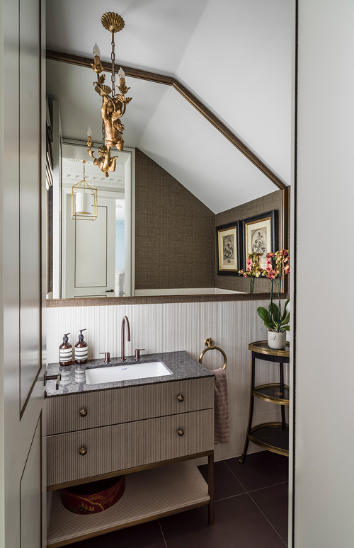
In the case of the powder room in our Carlton Hill project, our design scheme features texture, straight lines and contrasting finishes, creating a small room bursting with character, warmth and opulence.
Tantalising texture
Located on the ground floor of a large, stucco-fronted house in St John’s Wood, this small guest WC needed to make a big impression. And as it sits alongside a series of formal entertaining spaces, our client wanted a luxurious and opulent look.
We opted for a textural theme dominated by stripes set against a warm palette of brown, gold and bronze. A combination of striped porcelain tiles and woven wallpaper has been used for the walls, along with a grey marble countertop and striped wooden veneer for the vanity unit. The overall feel is one of warmth, welcome and comfort.
We wanted to use a real variety of textures – fabric, metal, wood and porcelain – to achieve a look which moves from modern minimalist to something much warmer and more welcoming. The mix of textures adds to the tactility of the room and invigorates the senses. The result is an enhanced sense of connection with the space and a heightened feeling of wellbeing.
In praise of stripes
A striped motif is a key element in the design of this powder room, featuring in both the pale porcelain tiles on the walls and the wood veneer on the vanity drawer fronts. Often a stripe adds such a pleasing geometry to a room and it’s also one of the few ‘patterns’ that can work alongside itself in various scales. Our use of stripes is also a nod to some of the themes employed in the rest of the house.
When working on a project, we always approach the design scheme holistically to ensure a synergy in the look and feel of the entire house. In this case, there was an overriding theme of stripes and rivets. Gentle fluting and stripes have been used in the joinery, furnishings and interior architectural features throughout the house. So it made perfect sense to incorporate stripes into the finishes of this room, too. These touches are quite subtle, but are all very purposeful.
The simple bronze tap chosen for the vanity unit also ties in with the clean, contemporary lines of the striped surfaces in the room. The balance between the contemporary elements and the more classic touches – the plant stand, towel rail and decorative light – adds to the welcoming and homely feel.
The power of reflection
One of the most challenging aspects of this powder room was its unusual shape caused largely by its understairs location. In order to maximise space and reflect as much light as possible, we commissioned a custom-made mirror with an antique brass frame to go above the vanity unit, reaching right up into the highest section of the room.
Given the compact size of this guest WC, we opted to allow the mirror to expand the full width of the wall so that it could reflect the beautiful textures and finishes. We also allowed a 50mm gap all the way around between the mirror and the wall so that the textured wallpaper could add to the effect the mirror creates.
3 Top tips for creating impact in a small powder room
1) Create a focal point
In a small space it’s important to include a feature that really grabs your attention and makes an impact. In the case of this particular project, our client’s loved the fact that we made the decorative cherub light the focal point of the room. It was an item they already owned and loved. You don’t always have to bring everything new into a space. A cherished possession can become a brilliant starting point for a scheme.
2) Introduce texture
Make sure you add textural elements to warm up what could otherwise be a bland, soulless guest WC. And don’t just keep it to one particular material – a variety of different types of texture such as wood, fabric and metal will help achieve a sophisticated result. These contrasts serve to please the eye at every turn and create a warm and stylish welcome.
3) Make it memorable
Remember that small can be beautiful and decorating a compact space really is a chance to push the boundaries with patterns or textures you might not think of using in other areas of your home. Our advice is to be brave with the smallest room in the house and create a real wow factor!
Photography by Mel Yates


