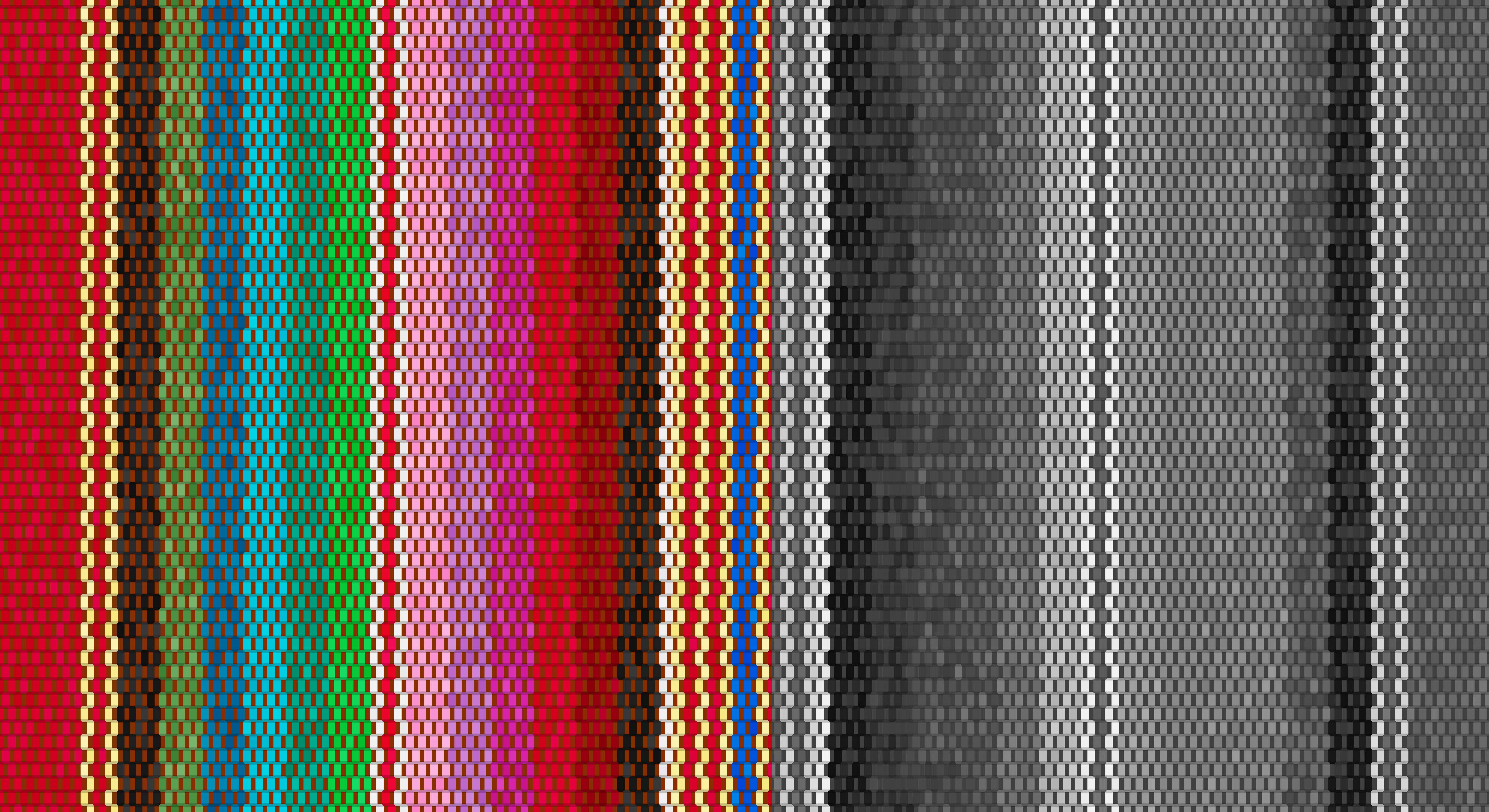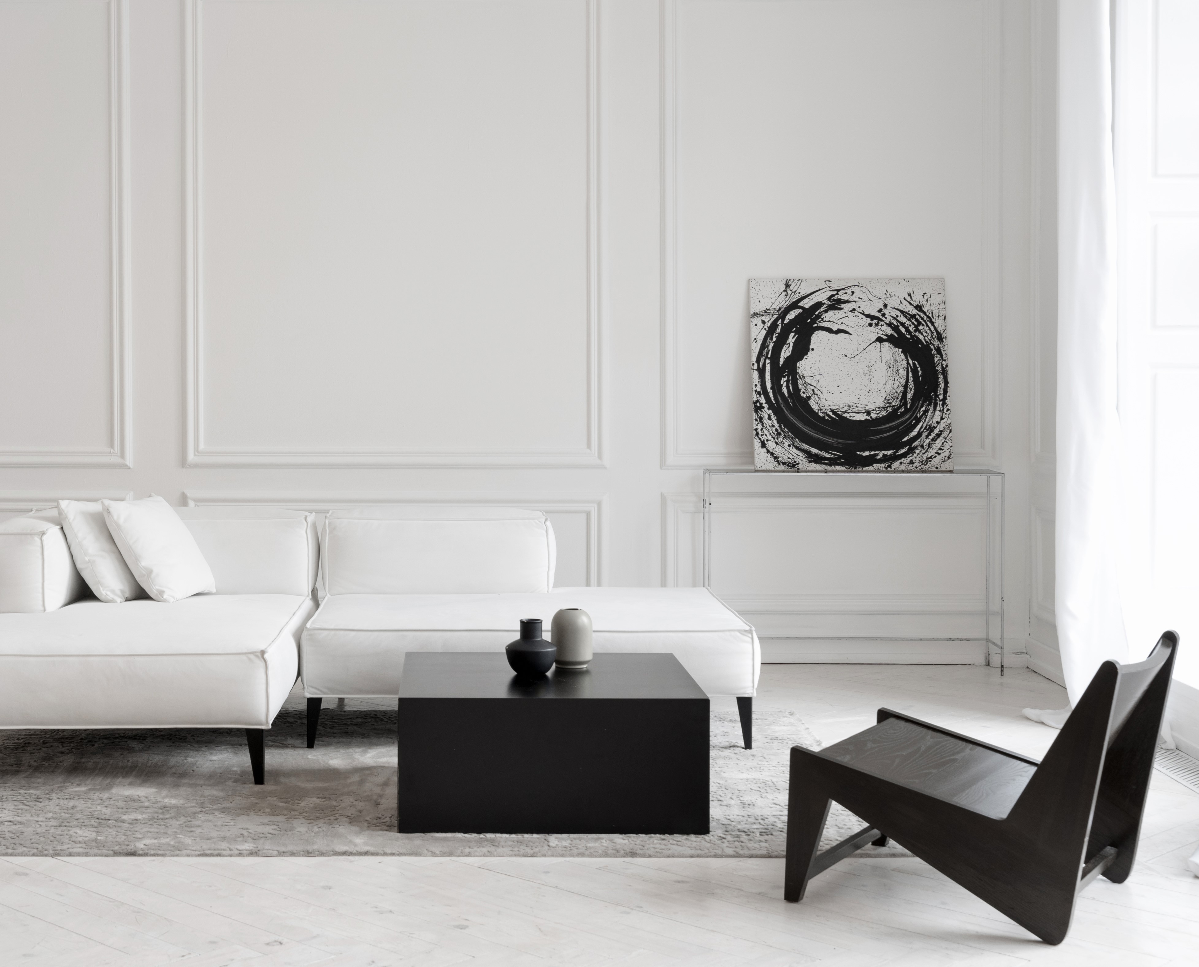

Maximalism and Minimalism are ever-evolving, highly contrasting ideologies that sit at opposite ends of the design spectrum. In this blog, we delve into the foundations of both movements, the principles that set them apart, and the intriguing possibility of being a lover of both. Can you really straddle both camps, or is it all just black and white? We also share some simple ways to experiment with these styles in your home, no matter where you fall on the design spectrum.


Minimalism
Minimalism is more than just a style; it’s a philosophy. Contrary to popular belief, it’s not about deprivation or going without but rather about intentionality and essentialism in design and consumption across all facets of life. By eliminating elements that jar or distract, Minimalism allows you to mindfully prioritise what’s essential and meaningful, creating a complete environment that contains everything it needs—no more, no less.
“Minimalism is not a lack of something. It’s simply the perfect amount of something.”
Nicolas Burroughs
The Minimalist movement gained recognition in the 1960s, beginning in Modern Art with the simplicity of geometric shapes and lines that marked a departure from the excesses of abstract expressionism. This approach quickly spread to other design disciplines, influencing architecture, interiors, product design, fashion, and lifestyle.
Today, Minimalist principles are interpreted in various interior design styles, from the quiet palettes and simple natural forms of Scandinavian design to Japanese Zen-inspired aesthetics that focus on creating uncluttered spaces promoting serenity and harmony. There’s also the raw, utilitarian quality of industrial-style Minimalism, featuring exposed brickwork, concrete surfaces, and metal accents.
To introduce Minimalism into your home, adopt a ‘less is more’ approach by making considered choices that focus on essential elements and embrace a pared-back aesthetic and material simplicity. Encourage open spaces that allow unrestrained movement and flow, incorporate clean lines, and keep surfaces clutter-free, allowing plenty of natural light to enter the space.
Create a flexible backdrop with a palette of neutral shades, and introduce natural materials and textures like wood, stone, and natural fibres to bring warmth and richness. Furnishings and accessories should be highly functional and only included if they truly enrich the space and bring purpose or joy. Each item must justify its place within this carefully considered aesthetic.
At its core, Minimalism is about creating a sense of clarity and order within a space to foster a calm, peaceful atmosphere. This aesthetic allows architectural details to shine and take center stage. Deceptively refined, practical, and well-judged, Minimalism has gained momentum as a lifestyle movement, welcoming a simpler and more intentional way of living amidst the chaos of modern life.
Maximalism
Maximalism, in contrast, is characterized by a bold fusion of elements, with flamboyant use of colour, pattern, and texture. Its historical roots lie in the elaborate art of the 17th-century Baroque period. After World War II, a new wave of artists and designers rejected the rigid rules and austerity of the time, embracing an innovative and experimental approach to colour and materials, often leaning towards abstraction.
The movement has seen many iterations, each reflecting its dynamic and theatrical nature. In recent fashion history, trailblazers like Gianni Versace and Jean Paul Gaultier pushed boundaries with their extravagant designs that dominated the catwalks of the 90s in a flamboyant celebration of glamour and excess.
“Kelly Wearstler currently holds the crown as the Queen of Contemporary Maximalism. She’s unafraid to adorn multiple surfaces, floors, and walls with big, bold designs. Her use of contrast, scale, and proportion in furniture design comes together in a statement of dynamic boldness that epitomizes Maximalism.”
Roselind Wilson – Founder and CEO, Roselind Wilson Design
Maximalism is a riot of abundance and energy, but considered curation is key. A rich variety of colours and textures can, and should, be used. The trick is to arrange these elements harmoniously. Pull off this bold scheme by introducing a strong colour palette or patterned wallpaper to elevate the mood and provide ambience. Then, adorn the space with contrasting elements, both old and new, keeping in mind that there’s no right or wrong way to do Maximalism—it’s a celebration of individuality and character, a visual reminder of your favourite objects. So don’t shy away from being playful and light-hearted.
Finding Balance
At Roselind Wilson Design, we believe the best design doesn’t come from rigid adherence to a specific style or set of rules. Instead, it emerges from embracing personal preferences and creating homes that truly reflect how our clients aspire and enjoy to live.
Take our Ennismore Garden project, for example. Our client was drawn to attributes from both ends of the design spectrum. The brief called for a complete redesign of this spacious Victorian apartment into a sleek, modern space with the opulent yet pared-back feel of a luxurious hotel suite. Minimalist preferences led us to omit the classic Victorian cornice and skirting in favour of a discreet shadow gap detail throughout. Custom joinery and walnut-clad walls provided the perfect backdrop to showcase a maximalist approach in the open-plan kitchen-living room, where a monolithic black and white island contrasts beautifully with the Nero Marquina worktop.
Whether you’re drawn to the opulence of Maximalism, the serenity of Minimalism, or something in between, get in touch with our expert design team to discuss your latest home renovation project.
