In the second of our series of behind-the-scenes blogs, we talk you through the design of the contemporary kitchen in our Belsize Park project. Formerly a reception room, we reconfigured this space as a kitchen to make the most of the high ceilings and grand proportions. Period detailing and contemporary fittings sit alongside each other harmoniously to create a sophisticated space that is very much the heart of the home.
What was the starting point for this design?
Our clients wanted us to create a large kitchen and dining area, but to ensure that it felt like a living space rather than simply a kitchen. They were also keen for us to incorporate as many of their favourite materials into the scheme such as metal, timber and marble.
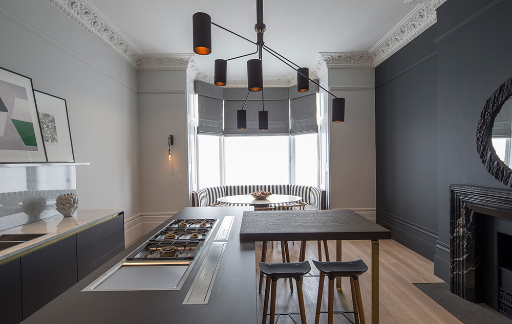
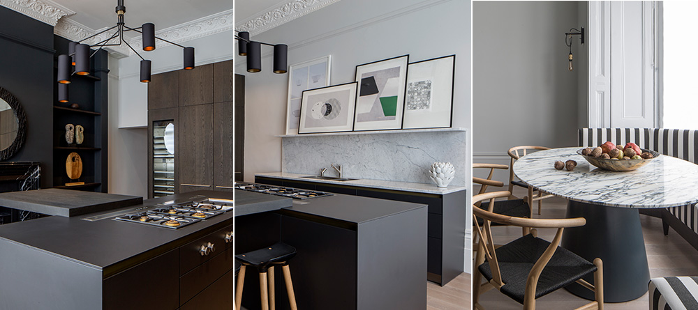
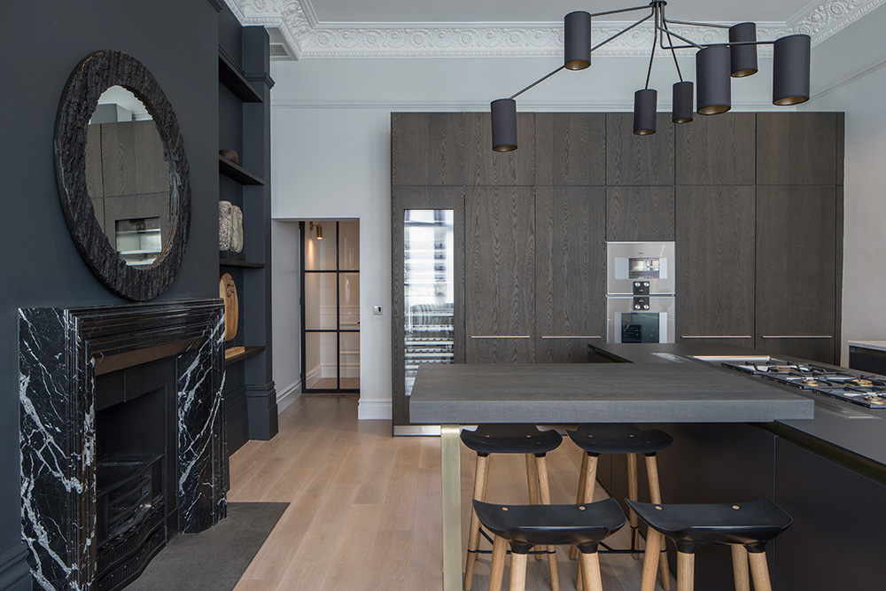
To meet this brief, we came up with a design that would celebrate the scale and proportions of this magnificent, high-ceilinged space. We created just one wall of tall cabinetry while keeping all the other units at a low level to ensure the room would feel sociable rather than ‘kitcheny’. The tall units were given a moody, gentleman’s club vibe with a dark brown oak veneer, while a graphite laminate finish was chosen for the island and sink units.
What was the biggest challenge you faced?
This project presented us with quite a few exciting challenges! But the biggest one was how to create a clean, contemporary look considering the room’s impressive period features. With a 3.8m ceiling height, ornate coving and an original ceiling rose, we worked closely with English Heritage on how best to retain and restore these beautiful details. Once this was achieved, we added sleek cabinetry from Kitchen Architecture’s Bulthaup B3 range to create a striking contrast with the period features.
Our idea was to create blocks of freestanding furniture rather than fitted joinery in order to retain a ‘living room’ feel to the space. The island unit was large enough to contain two Gaggenau gas hobs as well as a pair of downdraft extractors, and the crisp Carrara marble on the sink run, splashback and dining table provides welcome contrast. The dramatic fireplace also adds to the sense of this room being a living space rather than ‘just’ a kitchen. We created a bespoke, honed Nero Marquina marble surround which adds drama to the space and chimes with the marble table top.
It was absolutely crucial to get these textural details right to perfect the relationship between the contemporary finishes and the period details. Several different textures such as bronze, blackened steel, oak and marble were used across the space to create depth and to achieve a clean, sophisticated look.
Can you tell us about the lighting?
Choosing the right lighting design for this scheme was absolutely essential because of the very high ceilings and dramatic period detailing. The large ceiling rose called for an equally imposing light so we decided CTO Lighting’s Array pendant would create the perfect balance. Its bronze and satin brass metalwork aligns with details on the cabinetry below, and its black cotton shades reference the feature wall and the striped banquette. The shades are also lined with a gold finish that creates a a lovely warm glow across the island and breakfast bar.
With such high ceilings, the task lighting had to be powerful and fully directional so that light could be targeted on the working areas around the sink and the island. We also used recessed spotlights for general lighting which are dimmable and controlled by an integrated lighting system. The graphite bare bulb hooked wall light positioned next to the banquette provides an extra visual touch.
What about the details?
Banquette seating felt like the natural choice for the beautiful, large bay window, so when we were planning our layout this became our starting point. Creating the bespoke, curved bench also allowed us to bring pattern and fabric into the mix. The strong, black-and-white stripes provide the perfect contrast to the Carrara marble topped table and classic wishbone chairs.
The other key practical aspect to this design was building in sufficient extraction. The clients are keen on cooking Asian food but didn’t want any lingering odours. However, because of the scale of the room, a standard downdraft extractor wasn’t going to be up to the task. Working closely with the mechanical and electrical contractor, we decided upon two downdraft extractors which would sit in front of the hobs within the island unit. We also sited secondary extraction in the ceiling which routed along the joists, through a wall cavity and out to an external vent. The result? A kitchen that both looks and smells beautiful!
How did the client feel about the end result?
The owners were truly delighted with their new kitchen. The look and feel of the room conveys the impression of a stately home while still retaining the edgy yet sophisticated style of this young, dynamic couple.
Our 3 top tips for kitchen design
1) Consider how you will use the space
It’s really important to think about how you’re going to use your kitchen before you start planning your design. Is cooking your main focus? Then you need to make sure you have adequate task areas and carefully sited appliances. Are you big entertainers? Then you may want to think about installing a sociable island around which you and your friends can gather for a glass of fizz!
2) Do your research & seek expert advice
With so many options available when it comes to units, appliances and materials for your new kitchen, it’s vital to do as much research as possible to ensure you make the right choices. However, this can feel like a bit of a minefield, which is one of the reasons our clients come to us for help. As interior design experts, it’s our job to keep up with the latest advances in materials, technology and lighting to help you make the right choices for your specific needs. Not only can we help you create a stunning kitchen which performs brilliantly, we can also help you avoid making costly mistakes.
3) Try to think holistically
When planning the look and feel of your kitchen, try to view it holistically in terms of how the design will fit in within the context of the home as a whole. As the kitchen is often the core socialising space, there needs to be a sense of flow and connection between this room and the rest of your home. In the case of our Belsize Park project, we were careful to ensure that the finishes and textures in the kitchen flowed organically throughout the entire apartment. Subtle links were created such as the use of blackened steel doors for the kitchen, master dressing room and shower to integrate the design aesthetic throughout the property.
Photography by Richard Waite


